Pivot tables are one of Excel's most powerful features. A pivot table allows you to extract the significance from a large, detailed data set.

Pivot Table is a great tool for summarizing and analyzing data in Excel.
We can use a Pivot Table to perform calculations on our data based on certain criteria. For example – Sales per Store, Sales per Year, Average Discount per Region, and many more…
Here are some of the advantages of using Pivot Tables:
- There is no need to use formulas in order to perform calculations.
- We can perform complex calculations in a quick and simple way.
- The summarized data is dynamic and can easily be applied to different sets of data
Creating a Pivot Table
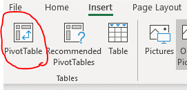
To create a new Pivot Table, we first need to select the data range which we would like to analyze, then click on one of the desired cells in our data range, then click Insert tab, then Pivot Table.
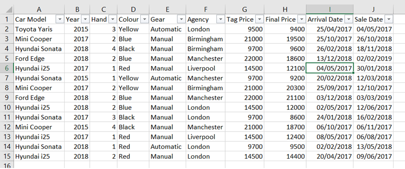
Let’s assume we want to analyze a database of cars sold by a car vendor:
To create a new Pivot Table:
- We will click on one of the cells in the data range.
- We will go to the Insert tab and click on Pivot Table:
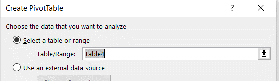
- Next, we will confirm that the selected range is indeed the right range.
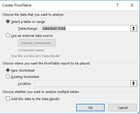
- Last, we will select “New Worksheet” to create the Pivot Table in a new worksheet, or “Exisiting Worksheet”, to place it in an existing worksheet.
After we decided to create a Pivot Table, we can see all the column headers – these are the fields from our database which we can work with:
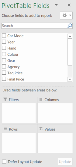
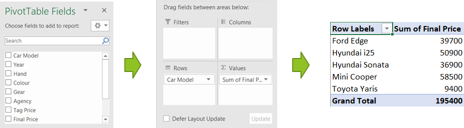
To start creating our Pivot Table, we can drag the different fields to the following areas:
- Rows – Here we will choose the field/s which we would like to base our Pivot Table rows upon.
- Columns – Here we will choose the field/s which we would like to base our Pivot Table columns upon.
- Filters – Here we will choose the field/s by which we would like to filter our data in the Pivot Table.
i.e.- we would choose “Year” to filter by a specific year. - Values – Here we will choose the field we want Excel to calculate and our desired calculation.
Creating a basic Pivot Table – Example
One of the most basic examples of using a Pivot Table is summing values of a specific field based on a criteria that appears in a different field.
In order to do so, we will drag the field which we would like to analyze into the “Rows” area or “Columns” if we would like to present the analysis in columns. We will the drag the field we want to sum into the “Values” area:
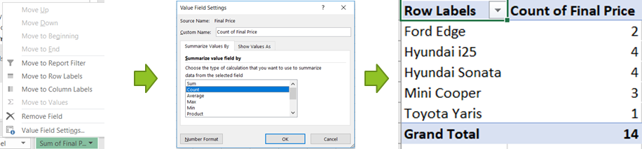
Changing the way Values are calculated
We will notice that most times, the basic calculation we will get when dragging a field to the “Values” area will be “Sum”.
We can change the calculation by clicking the field after we dragged it into the “Values” area, then “Value Field Settings…”, which will open a menu where we can choose to sum, count, average and many more calculations:
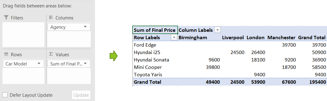
Segmentation to Columns and Rows
We can segment the data using rows and columns simultaneously by dragging fields to the “Rows” and “Columns” areas:
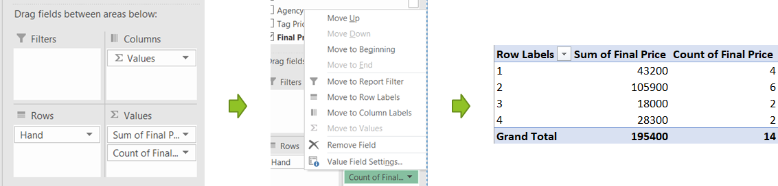
Performing multiple calculations on the same field
We can perform a number of different calculations on the same field by dragging the field several times to the “Values” area and changing the type of calculation in each of the columns:
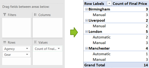
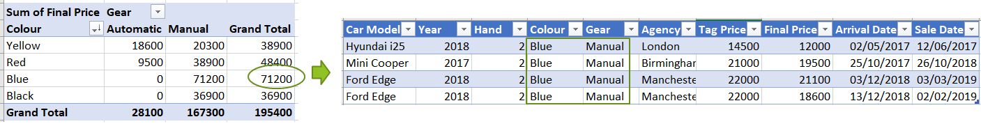
Segmentation of more than one field
In the Pivot Table, we can segment based on more than one field by dragging several fields into the “Rows” area:
Designing a Pivot Table
Changing the Pivot Table design to classic table design
In order to give the Pivot Table a “classic” look, where each field is presented in a different column, we will click the Pivot table, click on “design” and perform the following steps:
- Click on Report Layout
- Click on “Show in Tabular Form” to show the table in a classic format
- Click on “Repeat All Items Labels” to show all item labels.
- We can click on “Do Not Show Subtotals” to hide the subtotals in the newly created table.
This is the process and final result:
![]()
Formatting a Pivot Table field
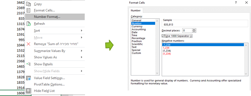
We can quickly select the way we wish to format a certain value field, by right-clicking the field and then clicking on “Format Cells”, or directly on “Number Format”, if we wish to format the values as number and add 1000 separator (4,524,254 instead of 4524254):
Designing missing values and errors
We can control the way missing values (empty cells) or errors are presented in the Pivot Table by right-clicking one of the cells and clicking on “Pivot Table Options”, then ticking “For error values shows” or “For empty cells show” (as shown in the following example)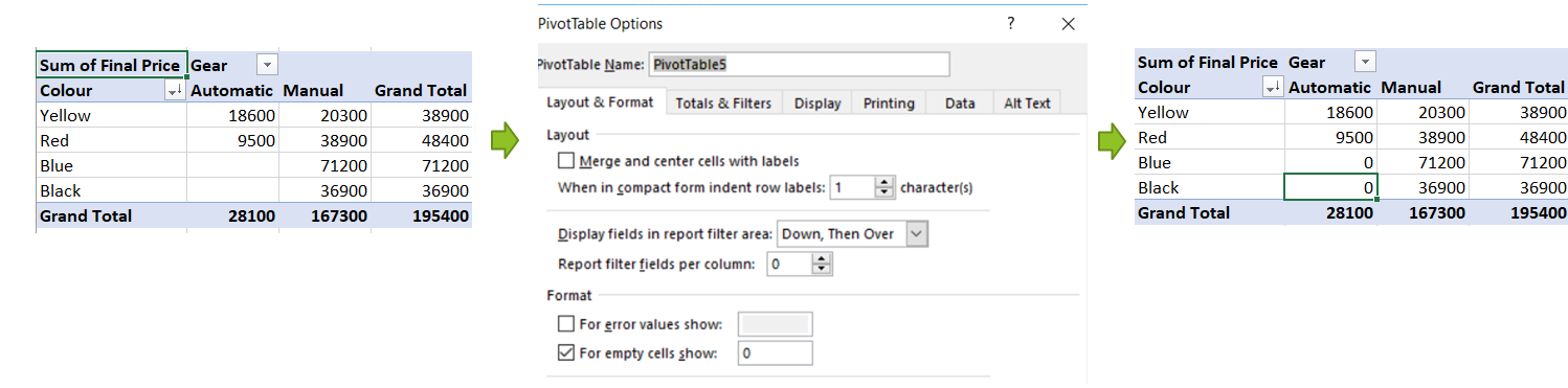
Filtering a Pivot Table
Filtering existing fields in a Pivot Table
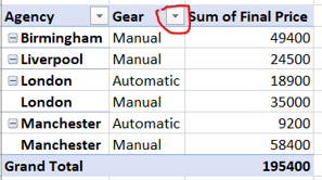
We can filter data shown in the Pivot Table rows simply by clicking the corresponding button in the desired field. For example, to filter the “Gear” field, we simply have to click the button next to the field name:
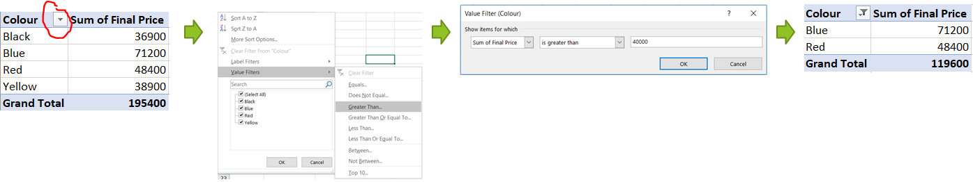
Filtering values in a Pivot Table
What if we wanted to filter the values in our Pivot Table?
To do so, we can start our filtering by clicking the filter button in one of the fields, then click on “Value Filters”, following which we will be able to see the various value filtering options.
Here’s an example of how to filter values greater than 40,000:
Adding an external filter to a Pivot Table
If we want to filter based on a field that is not currently in the Pivot Table, we could drag that field into the “Filters” area:
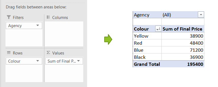
Please note – we can add more than one field to the “Filters” area.
Sorting values in a Pivot Table
If we want to sort our fields, we just have to right-click on the desired field and click on “Sort”:
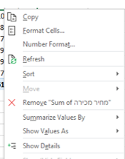
Updating and refreshing the Pivot Table data
After updating the source data, we have to refresh the Pivot Table in order for the new data to be reflected in the Pivot Table. We can do that by right-clicking the table and clicking on “Refresh” or by Refresh/Refresh all in the “Data” group
Adding new data at the end of the data range
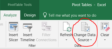
If we want to add new data to our Pivot Table that will be added at the end of the previously used data range, we need to update the source data’s range by clicking on “Change Data Source” in the “Data” group:
Another way of dealing with this issue is by adding the new data in the middle of the previously used data range and then refreshing.
Automatically update Data Source Range when adding new rows by using Tables
Another way to save time if we are planning to update the data source range often is changing the data source range to a table by clicking in “Table” in the “Insert” tab or by clicking CTRL+T
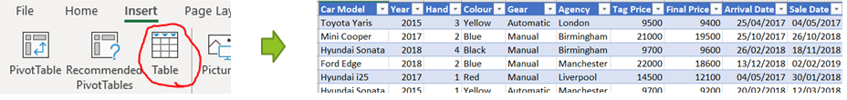
Now we can create/update the Pivot Table that will use the table as the source data, and when the table will be updated- the Pivot Table’s source data range will be updated as well. Here’s how our Data Source looks like:
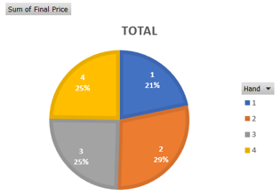
Show Values As
We can present the calculated values in the “Values” area in different ways, i.e. a percentage of total, by clicking the desired value in the “Values” area, then clicking on “Value Field Settings” and then on “Show Value As”: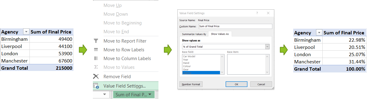
Presenting a breakdown of a value in a Pivot Table
Whenever we like, we can present all the items that are calculated in a certain cell in the Pivot Table by double-clicking that cell. This will result in a new sheet opening:
Grouping Data
We can group data presented in the Pivot Table’s rows and columns with “Group” and reverse it with “Ungroup” by right-clicking one of the cells:
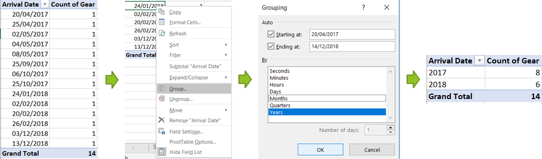
Date data will usually be grouped automatically to months/years
We can also group numerical data (i.e 1-100, 101-200, etc.)
Creating Pivot Charts
We can add charts to existing Pivot Tables or create new charts based on a new Pivot Table.
- Existing Pivot Table – We will click on the “Analyze” tab and then on “Pivot Chart” in the “Tools” group (we have to select a cell in the Pivot Table before doing this)
- Creating a new Pivot Table – “Insert” tab -> “Pivot Chart” in the “Charts” group (we have to select the desired source data before doing this)
When we click on the Pivot Chart, the names of the categories will look like this:

Like any other chart, we can control the axis’ directions and the chart type by clicking on the “Design” tab. We can, for example, replace the X and Y axis by “Switch Row/Column” in the “Design tab”. We can also change the Chart type:
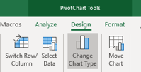
It is important to note that Pivot Charts behave exactly as Pivot Tables, so each functionality that can be used in Pivot Tables, can also be used in Pivot Charts.
Adding Slicers / Timelines to a Pivot Table
Adding Slicers to a Pivot Table
- We can add Slicers to our Pivot Table / Chart, which will enable visually filtering the field, by clicking on the “Analyze” tab and then on “Insert Slicer”. Here’s how it looks:
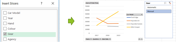
- We can have multiple slicers to our Pivot Table, which will work simultaneously:
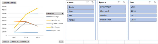
- We can select several values in the Slicer by using CTRL/ SHIFT.
- To cancel the filtering of a Slicer, we will click on this button at the top of the Slicer:
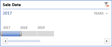
Adding a Timeline to a Pivot Table
For date fields, we can add a Timeline by clicking on the “Analyze” tab and then on “Insert Timeline”:
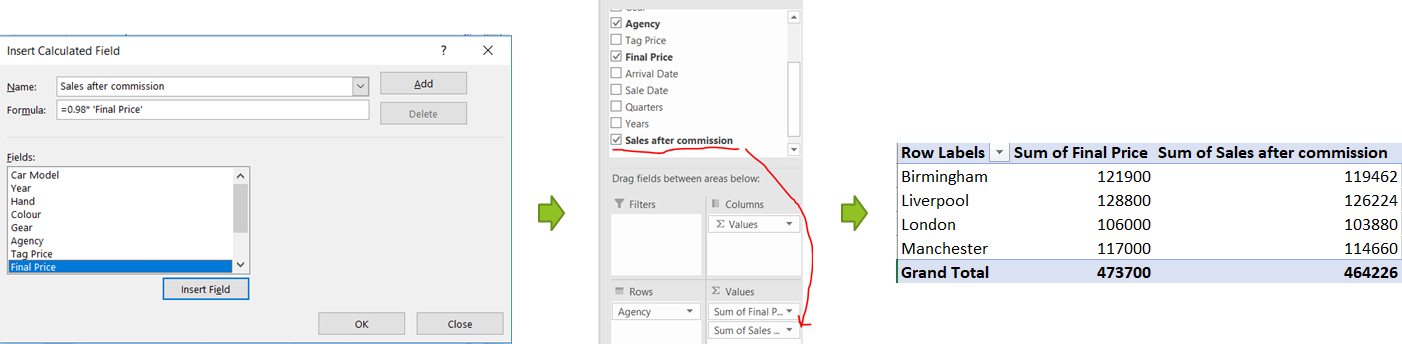
Pivot Table Calculated Fields
We can perform calculations within the Pivot Table itself, Instead of creating calculation columns in the source data. For that, we can use a “Calculated Field”.
A Calculated Field is calculated based on the sum of a certain field.
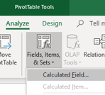
We will add a Calculated field by clicking on:
Analyze tab -> Fields, Items & Sets -> Insert Calculated Fields:
We will name each Calculated Field and write the desired formula for it (you can insert the desired field by double-clicking it).
Here’s an example of calculating the Sales amount after a 2% commission:
 Reviewed by Excel Suite
on
January 15, 2021
Rating:
Reviewed by Excel Suite
on
January 15, 2021
Rating:

No comments: